Contents
- Matplotlib Tutorial - 파이썬으로 데이터 시각화하기
- Matplotlib 설치하기
- Matplotlib 기본 사용
- Matplotlib 숫자 입력하기
- Matplotlib 축 레이블 설정하기
- Matplotlib 범례 표시하기
- Matplotlib 축 범위 지정하기
- Matplotlib 선 종류 지정하기
- Matplotlib 마커 지정하기
- Matplotlib 색상 지정하기
- Matplotlib 그래프 영역 채우기
- Matplotlib 축 스케일 지정하기
- Matplotlib 여러 곡선 그리기
- Matplotlib 그리드 설정하기
- Matplotlib 눈금 표시하기
- Matplotlib 타이틀 설정하기
- Matplotlib 수평선/수직선 표시하기
- Matplotlib 막대 그래프 그리기
- Matplotlib 수평 막대 그래프 그리기
- Matplotlib 산점도 그리기
- Matplotlib 3차원 산점도 그리기
- Matplotlib 히스토그램 그리기
- Matplotlib 에러바 표시하기
- Matplotlib 파이 차트 그리기
- Matplotlib 히트맵 그리기
- Matplotlib 여러 개의 그래프 그리기
- Matplotlib 컬러맵 설정하기
- Matplotlib 텍스트 삽입하기
- Matplotlib 수학적 표현 사용하기
- Matplotlib 그래프 스타일 설정하기
- Matplotlib 이미지 저장하기
- Matplotlib 객체 지향 인터페이스 1
- Matplotlib 객체 지향 인터페이스 2
- Matplotlib 축 위치 조절하기
- Matplotlib 이중 Y축 표시하기
- Matplotlib 두 종류의 그래프 그리기
- Matplotlib 박스 플롯 그리기
- Matplotlib 바이올린 플롯 그리기
- Matplotlib 다양한 도형 삽입하기
- Matplotlib 다양한 패턴 채우기
- Matplotlib 애니메이션 사용하기 1
- Matplotlib 애니메이션 사용하기 2
- Matplotlib 3차원 Surface 표현하기
- Matplotlib 트리맵 그리기 (Squarify)
- Matplotlib Inset 그래프 삽입하기
Tutorials
- Python Tutorial
- NumPy Tutorial
- Matplotlib Tutorial
- PyQt5 Tutorial
- BeautifulSoup Tutorial
- xlrd/xlwt Tutorial
- Pillow Tutorial
- Googletrans Tutorial
- PyWin32 Tutorial
- PyAutoGUI Tutorial
- Pyperclip Tutorial
- TensorFlow Tutorial
- Tips and Examples
Matplotlib 3차원 산점도 그리기
matplotlib.pyplot 모듈의 scatter() 함수를 이용해서 3차원 산점도 (3D Scatter plot)를 그리는 방법을 소개합니다.
Keyword: scatter(), 3D scatter plot, 3차원 산점도
기본 사용
예제
from mpl_toolkits.mplot3d import Axes3D
import matplotlib.pyplot as plt
import numpy as np

n = 100
xmin, xmax, ymin, ymax, zmin, zmax = 0, 20, 0, 20, 0, 50
cmin, cmax = 0, 2

xs = np.array([(xmax - xmin) * np.random.random_sample() + xmin for i in range(n)])
ys = np.array([(ymax - ymin) * np.random.random_sample() + ymin for i in range(n)])
zs = np.array([(zmax - zmin) * np.random.random_sample() + zmin for i in range(n)])
color = np.array([(cmax - cmin) * np.random.random_sample() + cmin for i in range(n)])

fig = plt.figure(figsize=(6, 6))
ax = fig.add_subplot(111, projection='3d')
ax.scatter(xs, ys, zs, c=color, marker='o', s=15, cmap='Greens')

plt.show()
이 예제는 임의로 생성된 100개의 x, y, z 값 데이터를 3차원 산점도로 나타냅니다.
설명
from mpl_toolkits.mplot3d import Axes3D
import matplotlib.pyplot as plt
import numpy as np
3차원 그래프를 그리기 위해서 from mpl_toolkits.mplot3d import Axes3D를 추가해줍니다.
n = 100
xmin, xmax, ymin, ymax, zmin, zmax = 0, 20, 0, 20, 0, 50
cmin, cmax = 0, 2
xs, ys는 0에서 20 사이, zs는 0에서 50 사이의 값을 갖도록 범위를 정해줍니다.
color는 0에서 2 사이의 값을 갖는 실수이고, 이 값을 통해 각각 다른 색을 표현합니다.
xs = np.array([(xmax - xmin) * np.random.random_sample() + xmin for i in range(n)])
ys = np.array([(ymax - ymin) * np.random.random_sample() + ymin for i in range(n)])
zs = np.array([(zmax - zmin) * np.random.random_sample() + zmin for i in range(n)])
color = np.array([(cmax - cmin) * np.random.random_sample() + cmin for i in range(n)])
np.random.random_sample()를 통해 각 범위 안에서 임의의 실수를 생성합니다.
이 부분은 아래와 같이 np.random.rand()를 이용해서 동일하게 만들 수 있습니다.
xs = (xmax - xmin) * np.random.rand(n) + xmin
ys = (xmax - xmin) * np.random.rand(n) + ymin
zs = (xmax - xmin) * np.random.rand(n) + zmin
color = (xmax - xmin) * np.random.rand(n) + cmin
fig = plt.figure(figsize=(6, 6))
ax = fig.add_subplot(111, projection='3d')
ax.scatter(xs, ys, zs, c=color, marker='o', s=15, cmap='Greens')
3D axes를 만들기 위해 add_subplot()에 projection=’3d’ 키워드를 입력해줍니다.
scatter() 함수에 x, y, z 위치를 어레이의 형태로 입력해줍니다.
c=color는 color 어레이의 값들이 색으로 표현되도록 합니다.
마커 (Marker)의 형태를 원형 (Circle)으로 정해줍니다.
(마커의 종류에 대해서는 마커 지정하기 페이지에서 확인하세요.)
cmap=’Greens’를 통해 colormap을 녹색 계열로 설정합니다.
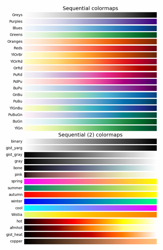
몇가지 colormap이 아래에 있습니다. 더 다양한 colormap은 공식 페이지 (링크)에서 확인할 수 있습니다.
결과는 아래와 같습니다.
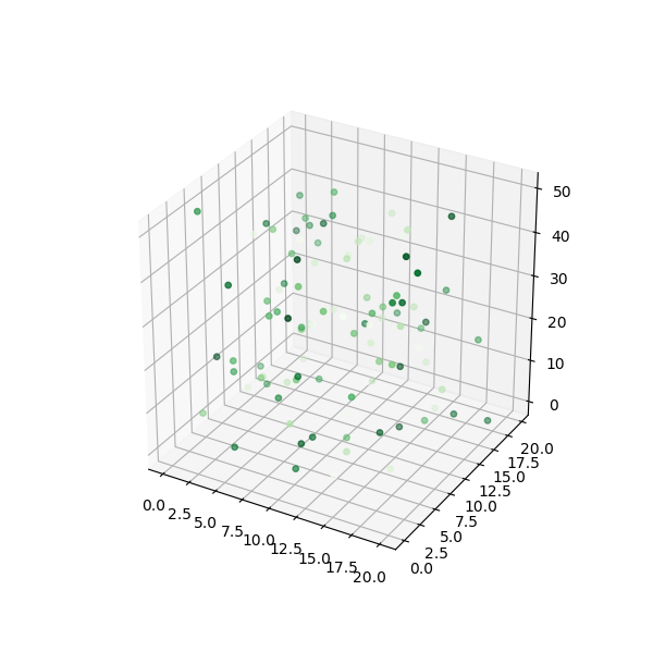
Matplotlib 3차원 산점도 그리기 - 기본 사용