Contents
- Matplotlib Tutorial - 파이썬으로 데이터 시각화하기
- Matplotlib 설치하기
- Matplotlib 기본 사용
- Matplotlib 숫자 입력하기
- Matplotlib 축 레이블 설정하기
- Matplotlib 범례 표시하기
- Matplotlib 축 범위 지정하기
- Matplotlib 선 종류 지정하기
- Matplotlib 마커 지정하기
- Matplotlib 색상 지정하기
- Matplotlib 그래프 영역 채우기
- Matplotlib 축 스케일 지정하기
- Matplotlib 여러 곡선 그리기
- Matplotlib 그리드 설정하기
- Matplotlib 눈금 표시하기
- Matplotlib 타이틀 설정하기
- Matplotlib 수평선/수직선 표시하기
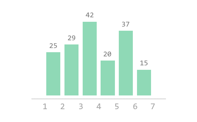
- Matplotlib 막대 그래프 그리기
- Matplotlib 수평 막대 그래프 그리기
- Matplotlib 산점도 그리기
- Matplotlib 3차원 산점도 그리기
- Matplotlib 히스토그램 그리기
- Matplotlib 에러바 표시하기
- Matplotlib 파이 차트 그리기
- Matplotlib 히트맵 그리기
- Matplotlib 여러 개의 그래프 그리기
- Matplotlib 컬러맵 설정하기
- Matplotlib 텍스트 삽입하기
- Matplotlib 수학적 표현 사용하기
- Matplotlib 그래프 스타일 설정하기
- Matplotlib 이미지 저장하기
- Matplotlib 객체 지향 인터페이스 1
- Matplotlib 객체 지향 인터페이스 2
- Matplotlib 축 위치 조절하기
- Matplotlib 이중 Y축 표시하기
- Matplotlib 두 종류의 그래프 그리기
- Matplotlib 박스 플롯 그리기
- Matplotlib 바이올린 플롯 그리기
- Matplotlib 다양한 도형 삽입하기
- Matplotlib 다양한 패턴 채우기
- Matplotlib 애니메이션 사용하기 1
- Matplotlib 애니메이션 사용하기 2
- Matplotlib 3차원 Surface 표현하기
- Matplotlib 트리맵 그리기 (Squarify)
- Matplotlib Inset 그래프 삽입하기
Tutorials
- Python Tutorial
- NumPy Tutorial
- Matplotlib Tutorial
- PyQt5 Tutorial
- BeautifulSoup Tutorial
- xlrd/xlwt Tutorial
- Pillow Tutorial
- Googletrans Tutorial
- PyWin32 Tutorial
- PyAutoGUI Tutorial
- Pyperclip Tutorial
- TensorFlow Tutorial
- Tips and Examples
Matplotlib 히스토그램 그리기
히스토그램 (Histogram)은 도수분포표를 그래프로 나타낸 것으로서, 가로축은 계급, 세로축은 도수 (횟수나 개수 등)를 나타냅니다.
이번에는 matplotlib.pyplot 모듈의 hist() 함수를 이용해서 다양한 히스토그램을 그려 보겠습니다.
Keyword: plt.hist(), histogram, 히스토그램
■ Table of Contents

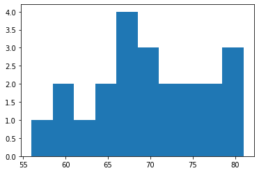
2) 구간 개수 지정하기
hist() 함수의 bins 파라미터는 히스토그램의 가로축 구간의 개수를 지정합니다.
아래 그림과 같이 구간의 개수에 따라 히스토그램 분포의 형태가 달라질 수 있기 때문에
적절한 구간의 개수를 지정해야 합니다.

예제
import matplotlib.pyplot as plt
weight = [68, 81, 64, 56, 78, 74, 61, 77, 66, 68, 59, 71,
80, 59, 67, 81, 69, 73, 69, 74, 70, 65]
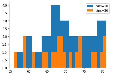
plt.hist(weight, label='bins=10')
plt.hist(weight, bins=30, label='bins=30')
plt.legend()
plt.show()
첫번째 히스토그램은 bins 값을 지정하지 않아서 기본값인 10으로 지정되었습니다.
두번째 히스토그램은 bins 값을 30으로 지정했습니다.
아래와 같이 다른 분포를 나타냅니다.
Matplotlib 히스토그램 그리기 - 구간 개수 지정하기
3) 누적 히스토그램 그리기

예제
import matplotlib.pyplot as plt

weight = [68, 81, 64, 56, 78, 74, 61, 77, 66, 68, 59, 71,
          80, 59, 67, 81, 69, 73, 69, 74, 70, 65]

plt.hist(weight, cumulative=True, label='cumulative=True')
plt.hist(weight, cumulative=False, label='cumulative=False')
plt.legend(loc='upper left')
plt.show()
cumulative 파라미터를 True로 지정하면 누적 히스토그램을 나타냅니다.
디폴트는 False로 지정됩니다.
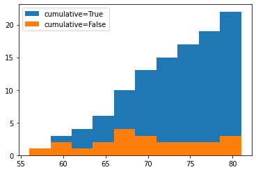
Matplotlib 히스토그램 그리기 - 누적 히스토그램 그리기
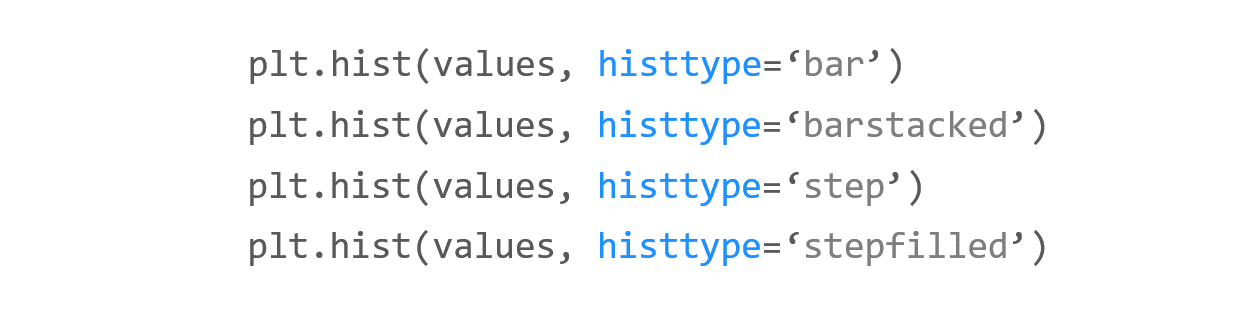
4) 히스토그램 종류 지정하기
예제
import matplotlib.pyplot as plt

weight = [68, 81, 64, 56, 78, 74, 61, 77, 66, 68, 59, 71,
        80, 59, 67, 81, 69, 73, 69, 74, 70, 65]
weight2 = [52, 67, 84, 66, 58, 78, 71, 57, 76, 62, 51, 79,
        69, 64, 76, 57, 63, 53, 79, 64, 50, 61]

plt.hist((weight, weight2), histtype='bar')
plt.title('histtype - bar')
plt.figure()

plt.hist((weight, weight2), histtype='barstacked')
plt.title('histtype - barstacked')
plt.figure()

plt.hist((weight, weight2), histtype='step')
plt.title('histtype - step')
plt.figure()

plt.hist((weight, weight2), histtype='stepfilled')
plt.title('histtype - stepfilled')
plt.show()
histtype은 히스토그램의 종류를 지정합니다.
{‘bar’, ‘barstacked’, ‘step’, ‘stepfilled’} 중에서 선택할 수 있으며, 디폴트는 ‘bar’입니다.
예제에서와 같이 두 종류의 데이터를 히스토그램으로 나타냈을 때, histtype의 값에 따라 각기 다른 히스토그램이 그려집니다.
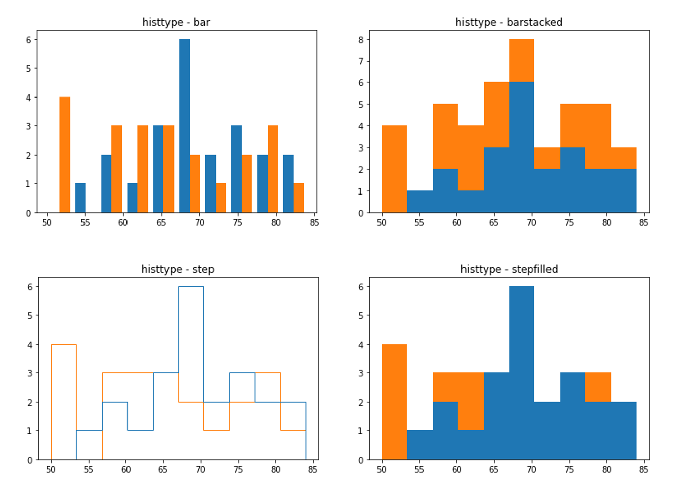
Matplotlib 히스토그램 그리기 - 히스토그램 종류 지정하기
5) NumPy 난수의 분포 나타내기
예제
import matplotlib.pyplot as plt
import numpy as np


a = 2.0 * np.random.randn(10000) + 1.0
b = np.random.standard_normal(10000)
c = 20.0 * np.random.rand(5000) - 10.0

plt.hist(a, bins=100, density=True, alpha=0.7, histtype='step')
plt.hist(b, bins=50, density=True, alpha=0.5, histtype='stepfilled')
plt.hist(c, bins=100, density=True, alpha=0.9, histtype='step')

plt.show()
Numpy의 np.random.randn(), np.random.standard_normal(), np.random.rand() 함수를 이용해서 임의의 값들을 만들었습니다.
어레이 a는 표준편차 2.0, 평균 1.0을 갖는 정규분포, 어레이 b는 표준정규분포를 따릅니다.
어레이 c는 -10.0에서 10.0 사이의 균일한 분포를 갖는 5000개의 임의의 값입니다.
density=True로 설정해주면, 밀도함수가 되어서 막대의 아래 면적이 1이 됩니다.
alpha는 투명도를 의미합니다. 0.0에서 1.0 사이의 값을 갖습니다.
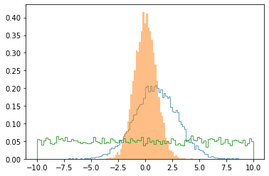
Matplotlib 히스토그램 그리기 - NumPy 난수의 분포 나타내기